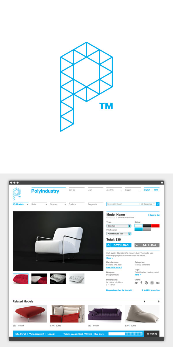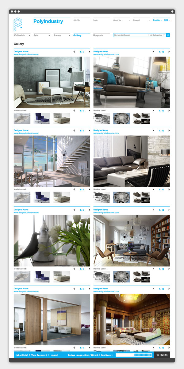

This project involved the planning and design concept for a stock 3D model eCommerce website. The brand evolved from a simple representation of the ‘P’ based on an isometric grid. I researched a number of the bigger stock image libraries to see what worked best for the navigation and user-flow through the site. The UI was kept clean and based on a grid with the key emphasis being on function and ease-of-use.

